ShopDreamUp AI ArtDreamUp

Deviation Actions


Description
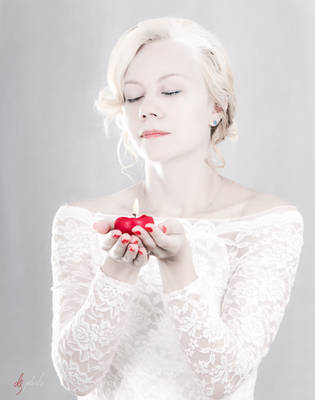
This is going to be September in my upcoming calendar.
If you like it, add me and you'll see what's coming up next...
I'm still looking for publishers.
 because of recent circumstances:


© 2009-2010 Michelle Fennel Photography | www.michellefennel.de
My work is protected under copyright law. My images are not produced, represented, sold, distributed, or licensed as stock photography. You may not use, print, distribute, reproduce, alter, edit, or manipulate my work in any way, either in it's entirety, or in portion, without express written consent and license from me.
In other words, don't steal...make your own.
-------------------------------------------------------------------
Model: Lea
Featured here:
Voted as most Outstanding Photograph May: [link]
Voted as one of the best Photographs of May: [link]
first - i ALWAYS! loved fairytales and when you look at my pieces you might notice that i have a kinda fairytalish style.they make you think and feel.
so when i saw her i was completely amazed. she DOES look like snow white. absolutley stunning! she is very open and most friendly so to shoot with her is a pure pleasure. so on one hand - i love the subject on the other hand it this my most important and heart related photography project.
this is my september from my calendar project. it's very time consuming. i had this concept many years as an idea in my head, it was stuck there and i couldn'T realize it and finally started to realize it this year. i first tried it in a test and the first try was sooo amazing that now all outstanding models of my region work with me. This calendar opened me completely new possibilities and options. this is, why this is my favorite.
______________________________________________
if you like this, please check out:


If you like it, add me and you'll see what's coming up next...
I'm still looking for publishers.
© 2009-2010 Michelle Fennel Photography | www.michellefennel.de
My work is protected under copyright law. My images are not produced, represented, sold, distributed, or licensed as stock photography. You may not use, print, distribute, reproduce, alter, edit, or manipulate my work in any way, either in it's entirety, or in portion, without express written consent and license from me.
In other words, don't steal...make your own.
-------------------------------------------------------------------
Model: Lea
Featured here:
Voted as most Outstanding Photograph May: [link]
Voted as one of the best Photographs of May: [link]
first - i ALWAYS! loved fairytales and when you look at my pieces you might notice that i have a kinda fairytalish style.they make you think and feel.
so when i saw her i was completely amazed. she DOES look like snow white. absolutley stunning! she is very open and most friendly so to shoot with her is a pure pleasure. so on one hand - i love the subject on the other hand it this my most important and heart related photography project.
this is my september from my calendar project. it's very time consuming. i had this concept many years as an idea in my head, it was stuck there and i couldn'T realize it and finally started to realize it this year. i first tried it in a test and the first try was sooo amazing that now all outstanding models of my region work with me. This calendar opened me completely new possibilities and options. this is, why this is my favorite.
______________________________________________
if you like this, please check out:
Image size
600x399px 142.99 KB
© 2010 - 2024 Michelle-Fennel
Comments120
Join the community to add your comment. Already a deviant? Log In
So before I did this, my Dad had looked at the screen and said "Oh thats a nice picture." And I realized for a second that looking at it from someone who is EXTREMELY non-art oriented, knowing nothing at all about art, that it pleases him. Before I tear this piece apart in my opinions, I do want you to know that that's what you have to keep in mind sometimes; whether a photo is good according to a photo critic, or to the common viewer. You get money from photos from viewers who like it, get jobs, etc. Even though there are minor things to fix. that is what it comes down to.
Okay, so let's get started. [This might be short though, I have a rough time critiquing photography that's more professional looking than average]
I have an issue with your composition, to start with. She's exactly in the center, and it's really really keeping my feeling like it's such a cramped space, and her flowy hair defies physics and shouldnt be flowy in a tight space. Things just don't work that way lol. I feel like she should be placed more to the right of the image, making the apple, the main subject, close to center, while the larger subject is leading to it. Main subjects can be in center, however supplements should be placed off to the side.
Your colors here are cool and warm, which bring a nice contrast. But there's something that bothers me, and I just think it's the blue in the hair. Lol no, I don't have problems with blue haired people. I think it's that with the red. It matches the darkness you convey here, yes. But..it just sticks out far too much for my liking. Perhaps just slightly darker on the hair? The skin is very nice and even toned, and her expression is nice. Though for a slight model critique (I never critique models but theres something with this) I'm not sure if you intended her to have a slight smirk on her face or not..but I feel like since this photo has kind of a dark solemn mood, it should be more gentle, or just without the smirk. But very beautiful, I will say. <img src="e.deviantart.net/emoticons/a/a…" width="15" height="15" alt="
The bow on the very right bothers me..it's slightly out of focus and I think its my whole composition issue. <img src="e.deviantart.net/emoticons/b/b…" width="15" height="15" alt="
I like the texture of the hair near the face and the wrist, it gives a nice texture instead of a fully soft photo, nice contrast.
I've never worked with portraits, so I say "Bravo!" for working with it. Also in most likely a studio setting..I've never worked with studios or flashes at all.
Anyways, I hope this was good enough critique <img src="e.deviantart.net/emoticons/a/a…" width="19" height="19" alt="
Good Job!
-Amanda